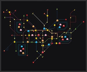
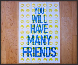
Pacman Tube Map
Everyone who has that one dream where they’re trapped in a Pacman game that is also the London Underground system will appreciate this funny print from the clever folks at publicgriefjunkie.
Everyone who has that one dream where they’re trapped in a Pacman game that is also the London Underground system will appreciate this funny print from the clever folks at publicgriefjunkie.
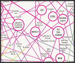
This 18″ x 24″ poster offers 282 sobriquets from the world of rap music, arranged according to semantics. Each poster is signed by the artists and numbered from the master edition.
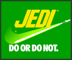
We think Wacky Packages for Star Wars (and a nod to Spaceballs too) when we look at these funny versions of the classic product logos that have been reinterpreted by Barn Bocock.
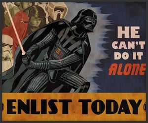
The fine folks over at Paste Magazine have rounded up a gallery of sweet and geeky old school posters propagating the Galactic Civil War from both sides of the fight. Thumbs up. (Thanks Levi!)
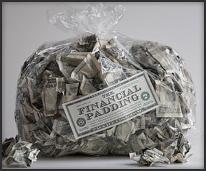
Screw foam peanuts – this is how ballers roll. Use these banknote look-alikes as packaging cushion, as pillow stuffing or for cheap tycoon showers. Reusable, recyclable and biodegradable.
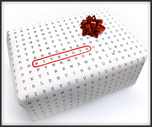
Fabio Milito’s cleverly designed wrapping paper is a clean-lined word jumble that makes a card unnecessary – you can simply circle the most appropriate gift-giving occasion. (Thanks Mark!)
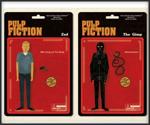
Buenos Aires-based artist Max Dalton created a supercool poster featuring The Pulp Fiction Action Figure Collection for an upcoming art show in New York. Wish we could be there to see it in person.
We’re liking the Fortune Poster series from Jason Dean; each of the 8 pieces coordinates colors and icons associated with a phrase from a real fortune cookie, and can be randomly chosen for you.
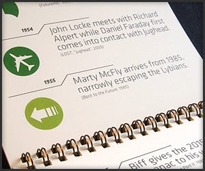
Instead of featuring sexy women or landscapes, Alex Griendling’s calendar nerds up, naming time travel-related incidents from video games, TV shows, and movies for each month.
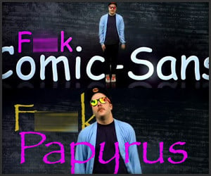
(NSFW) Graphic designers and CG artists out there should appreciate Money Money Money’s music video entitled “Gettin’ Money with a Mouse and a Wacom Pen (F*ck Comic Sans F*ck Papyrus, Too)”.
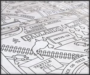
Dan Cassaro’s clever Garden State map based on Springsteen lyrics shows us where they haunt this dusty beach road in the skeleton frames of burned out Chevrolets, among other places. (Thanks Nik!)
Elevator passageways at London Underground’s Notting Hill Tube Station were sealed to modernize in the 1950’s; recent work at the station has revealed a rich time capsule filled with vintage ads.
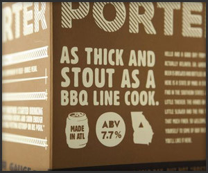
We’re digging the clever packaging 22Squared designed for Atlanta’s Red Brick Beer, which includes some laugh-out-loud humor and tongue-in-cheek Southern storytelling. (Thanks, Josh!)
Designer Alex Varanese illustrations envision an alternate version of the disco era, with the assumption he could go back in time with 2010 technology and market it to a whole new audience.
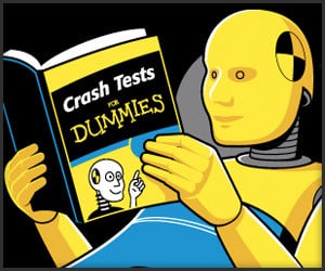
Our friends over at GLENNZ Tees are at it again – this time with an explanation of how crash test dummies study while they’re getting ready for their jobs. Works on more levels than most t-shirts.
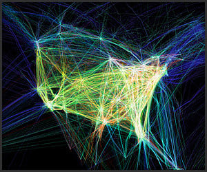
Aaron Koblin took data from FAA flight traffic control and ran it through a Processing application, After Effects and Maya to produce these incredible images of airplanes’ nerve-like interconnections.
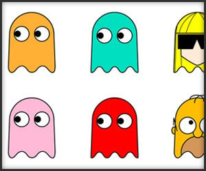
We all know Inky, Blinky, Pinky and Clyde, but we bet you didn’t know about some of the lesser known ghosts from the game. This handy guide by CMYBacon should help you sort things out.
Remember Juan Pablo Bravo’s Pixar character scale comparison chart? We’ll he’s back. This time he’s got 250 Disney characters over the years – at a whopping 20,779 pixels wide.
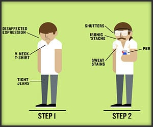
Check out this amusingly brilliant chart that outlines the visual evolution of the distinct hipster subculture into the seemingly opposite hippie culture. And let that be a lesson to you.
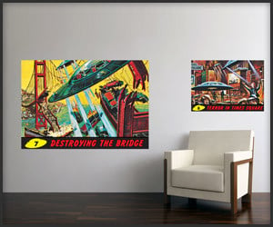
LTL Prints has launched a collection of Mars Attacks wall graphics featuring original artwork from the classic collectible Topps trading cards. They’re self-adhesive and available in a variety of sizes.
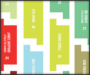
Alexa Edgerton has created a cool rockstar tragedy chart by placing names and ages of over 300 musicians into a shapely pattern made from music rest symbols and colors indicating cause of death.
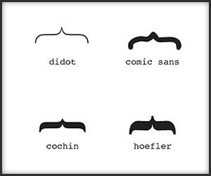
Get your mind off of bombs placed in metropolitan areas, encroaching oil spills and ash cloud aftermath with this fine chart that categorizes your mustache by its corresponding font.
Home | About | Suggest | Contact | Team | Links | Privacy | Disclosure
Advertise | Facebook | Twitter | Pinterest | Sites We Like
Awesome Stuff: The Awesomer | Cool Cars: 95Octane
Site Design & Content © 2008-2024 Awesomer Media / The Awesomer™