Dyslexie Font
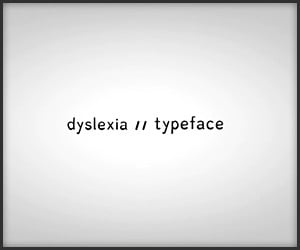
Dyslexie is a typeface specially designed and proven in studies to help dyslexics read. Designed by Christian Boer (who is also dyslexic) of Studiostudio. Too bad it’s so expensive.
Dyslexie is a typeface specially designed and proven in studies to help dyslexics read. Designed by Christian Boer (who is also dyslexic) of Studiostudio. Too bad it’s so expensive.
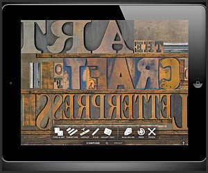
LetterMPress lets you experience traditional letterpress printing on the iPad. Every step of the process is emulated, providing a familiar interface for experts and a friendly start for beginners.
Jacob Gilbreath made this gigantic slab of kinetic typography from Conan O’Brien’s unforgettable, inspiring and touching farewell message on the last episode of his stint at The Tonight Show.
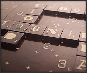
Design student Andrew Clifford Capener has created the A-1 Scrabble Designer Edition, which would come with customized typography tiles, a walnut scrabble board and cork lined exterior box.
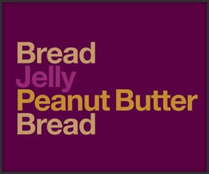
The Type Sandwiches series, a typographic series of food created using only color and the Helvetica font, is part of David Schwen’s MSCED project and was inspired by his original Burgervetica design.
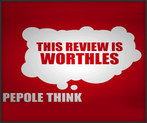
Ricepirate’s hysterically funny typographical video features an epic voice actor’s performance of a game review rant by a 13 year old, committing to all its grammatical belligerence. (Thanks Jorgen!)
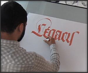
Calligraphist Luca Barcellona shows off his Fraktur writing skills for the Legacy of Letters tour. We never thought watching someone write could be this absorbing. Props for the great music.
If anyone out there is looking for a little inspiration for the new year, Taylor Mali’s dynamic poem for a teacher’s inservice audience should do the trick – whether you’re in education or not. (Thanks Doug!)
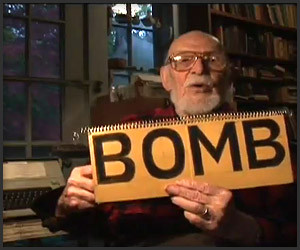
The late American typographer Ed Rondthaler explains some of the idiosyncracies and complexities of spelling in the English language. It’s a miracle any of us actually know how to spell.
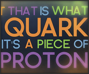
Hank of the Vlog Brothers gives us a primer about quarks via a catchy tune and kinetic typography. If only high school Physics was this addictive. “Up, Down, Strange, Charm, Top, Bottom…”
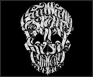
Joby Cummings has woven the 7 deadly sins into the unmistakable likeness of a skull, while also providing a convenient way to keep track of how to avoid eternal damnation. Thanks, man.
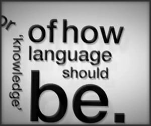
Matt Rogers created this kinetic typography based on a segment of “Language”, a podcast by British TV host, writer and comedian Stephen Fry. You can download the entire podcast here.
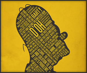
Like peanut butter and chocolate, we are enjoying the combo of typography with iconic pop culture references from Jerod Gibson; it’s also a great way to remember your movie quotes. (Thanks James!)
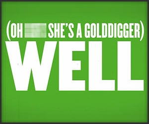
NSFW! Ah geez. We are detecting heavy notes of sadness and bitterness infused with humor in this (unofficial) lyric video for Cee-Lo Green’s upcoming single, F*** You, due out in early October.
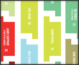
Alexa Edgerton has created a cool rockstar tragedy chart by placing names and ages of over 300 musicians into a shapely pattern made from music rest symbols and colors indicating cause of death.
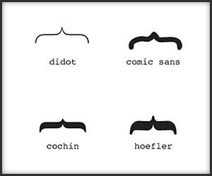
Get your mind off of bombs placed in metropolitan areas, encroaching oil spills and ash cloud aftermath with this fine chart that categorizes your mustache by its corresponding font.
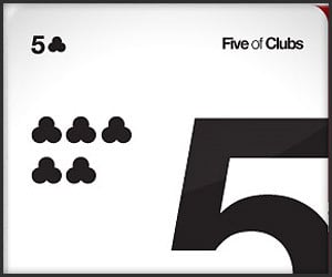
Card players and typography fans alike can add some clean lines to their Texas Hold ‘Em games with Helveticards, printed on premium quality card stock and featuring the classic typeface.
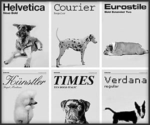
Four-legged typographers everywhere are howling over Grafisches Buro’s Fonts by Dog, which attempts to match classic typefaces with panting, drooling, and barking faces.
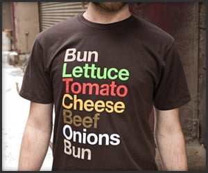
Just because a typeface is sans serif doesn’t mean it can’t be done tastefully: David Schwen’s Burgervetica T-shirt is well done for both typography and gastronomy fans.
Home | About | Suggest | Contact | Team | Links | Privacy | Disclosure
Advertise | Facebook | Twitter | Pinterest | Sites We Like
Awesome Stuff: The Awesomer | Cool Cars: 95Octane
Site Design & Content © 2008-2024 Awesomer Media / The Awesomer™