When you buy through links on our site, we may earn an affiliate commission. As an Amazon Associate I earn from qualifying purchases.

Awesome Typography

Magnetic Letterpress

Magnetic Letterpress

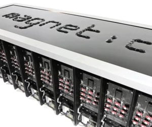
Designers Graham Plumb and Stephen Braitsch collaborated on this amazing mechanical display that uses a series of 180 magnets to write text in a pool of ferrofluid. They built 10 custom machines which are programmed to raise and lower magnets, creating the segmented letters in the oily fluid.

Textless

Textless

Husband and wife design team Gareth Smith & Jenny Lee’s typographic short film plays a clever visual trick, simulating the physics of what might happen if all of the letters on advertising signage started to break loose from their appropriate locations, and came to rest in totally haphazard ways.

Advertisement

Joywave: Obsession

Joywave: Obsession

Director Dimitri Basil’s music video for the Joywave track Obsession is both a tribute to and a loving parody of vintage movie title sequences, featuring an array of convincing, but fake opening credits for spaghetti westerns, exploitation flicks, B-movies, and much more. Quentin Tarantino would be proud.

Brand Alphabet

Brand Alphabet

Graphic and motion designer Vinicius Araujo envisioned iconic industrial designs from electronics brands as Helvetica letter forms corresponding to their brand names. We’d love to see actual products designed this way. Check out the full alphabet in his Behance portfolio.

The Story of Futura

The Story of Futura

Designed by Paul Renner in 1927, Futura became the first widely used sans serif font and remains a popular choice because of its efficient and clean design. Vox put on its Wes Anderson hat to sum up the font’s history.

The Man Behind Comic Sans

The Man Behind Comic Sans

It’s the world’s most derided and improperly used typeface, but there’s no denying that Comic Sans is iconic. Great Big Story introduces us to Vincent Connare, the typographer who came up with the casual font while working at Microsoft, and explains its genesis.

Origins of the Comic Book Font

Origins of the Comic Book Font

Vox looks at the history and evolution of comic book lettering. The most well known style – all caps, italicized, and with consistent thickness – was developed to make text easier to read on cheap paper. But there are dozens of comic book fonts and lettering styles.

Advertisement

Make It Stranger

Make It Stranger

Creative studio Nelson Cash made a web app that lets you make your own text in the style of Stranger Things’ title design. You can download the image, tweet it, or post it on Facebook.

Making Stranger Things’ Title Sequence

Making Stranger Things’ Title Sequence

Stranger Things’ title sequence is a perfect complement to the show’s ’80s aesthetic. Vox spoke with the folks who made the sequence, Imaginary Forces – who also made the openers for Mad Men, Boardwalk Empire, Jessica Jones, etc. – about their project.

Being a Title Designer

Being a Title Designer

Dan Perri has created titles and title sequences for Star Wars IV, Taxi Driver, Gangs of New York and more. He spoke with the Oscars about his career, his tools and his penchant for adapting rather than stamping his own style to the movie he’s working on.

Why the Wingdings Font Exists

Why the Wingdings Font Exists

Vox once again asking the right questions. The infamous Wingdings was never meant to be used as a substitute for letters. Like its predecessor, its characters are meant to be used to decorate a page. Some symbols also stand in for words, i.e. as emoticons.

Dangerdust

Dangerdust

Dangerdust is the moniker of two (partially) anonymous Columbus College of Art & Design students. Every week, they make impressive typographic chalk art of a memorable quote and leave it on campus. Learn more about them here.

Advertisement

Major Lazer & Pharrell: Aerosol Can

Major Lazer & Pharrell: Aerosol Can

(NSFW: Language) The music video for Aerosol Can features an ill typographic time-lapse, achieved with the help of graffiti and tattoo artist Mike Giant and creative studio Abel14. The song is from Major Lazer’s latest EP Apocalypse Soon.

The History of Typography

The History of Typography

A stop-motion animation about the origin and the pivotal developments in the field of typography. Ben Barrett-Forrest does a great job of explaining the differences and the rationale behind different typefaces.

Type Delight

Type Delight

Wonderful posters with imagery made using food and ingredients. Visual communication design student Nina Harcus made them for a story/recipe book about a chef who falls in love with typography.

Typographic Chess Set

Typographic Chess Set
Buy

A limited edition chess set by Hat Trick Design for typography enthusiasts. The chess pieces take the form of the first letter(s) of their names. Made from laser cut acrylic. Video here.

The Impossible Typeface

The Impossible Typeface

Inspired by the famous Penrose Triangle, Martzi Hegedűs created Frustro, a typeface that also serves as an optical illusion. All Frustro characters face two different directions at once.

Brand Memory Game

Brand Memory Game
Buy

Equal parts game, social commentary and homage to iconic logos, the Brand Memory Game has players identifying matching cards based on the colors, style and typography of famous brand logos.

Procrastination

Procrastination

Do you constantly put things off until tomorrow? Then watch this brief typographic animation for a little explanation – and advice – on procrastination. Watch now, and don’t bookmark it for later.

Stop Forwarding That Crap

Stop Forwarding That Crap

Weird Al’s anthem for people who are saddled with human spam. Share the song to them for a not-so-subtle hint. Of course they might think the song sucks and hate you for forwarding crap to them.

Noa Bembibre Calendar

Noa Bembibre Calendar
Buy

We love the bold typography and nonsensical sayings that Noa Bembibre’s calendar has to offer. Sold in an edition of 700, it’s printed in four colors on and finished with black ribbon binding,

Honest Logos

Honest Logos

Viktor Hertz uses his image manipulation jutsu to poke fun at popular brands. Some of the logos are funnier than others while many are exaggerated, but they all look just like the real deal.

Typeshelf

Typeshelf
Buy

Part of Ufuk Keskin’s Flatobjects series, Typeshelf turns the symbol into the symbolized – or is the other way around? Either way, you can also have your order customized with your own design.

ADVERTISEMENT

Home | About | Suggest | Contact | Team | Links | Privacy | Disclosure
Advertise | Facebook | Twitter | Pinterest | Sites We Like

Awesome Stuff: The Awesomer | Cool Cars: 95Octane
Site Design & Content © 2008-2024 Awesomer Media / The Awesomer™